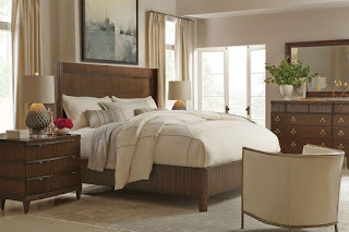
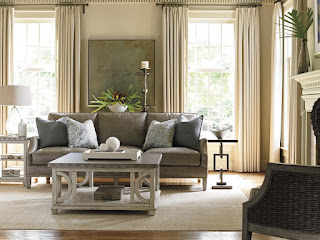
When some people think of “transitional design,” they think it means no style at all. Or they think of something like eclectic design. Neither is the case. Transition means changing or moving forward from one place into another. You can understand the style by looking at the root of this word. When applied to design, it means seamlessly blending traditional and modern elements into a design that makes sense.
This design style is more than just tossing all the rules aside and mixing traditional elements with modern, minimalist or clean-lined furniture. Done well, it creates a beautiful, balanced space. Done not so well, then not so much. If transitional design is something you are interested in, these tips will hep you mix seemingly unrelated styles into a balanced design that works in your home.
Saturday, November 10, 2018
Monday, November 5, 2018
Pumpkin-Spice Up Your Home for Fall
The signs of Fall’s arrival in Florida are clear: temperatures reach a balmy 80-ish degrees, until the first, and possibly only, cold front rolls through. However, there’s one universal sign that Fall has arrived across the country, and that’s the arrival of pumpkin spice everything.
With the arrival of August (technically not even Fall) the sweet, spicy blend shows up everywhere. And while you may not see the need for pumpkin spice doggy lattes, a little pumpkin spice in your décor can make sipping your own latte extra special.
With the arrival of August (technically not even Fall) the sweet, spicy blend shows up everywhere. And while you may not see the need for pumpkin spice doggy lattes, a little pumpkin spice in your décor can make sipping your own latte extra special.
Tuesday, October 9, 2018
7 Important Finishing Touches to Style Your Home
Once you’ve got your walls painted and your furniture placed just so, you’re done, right? Of course not. By now everyone probably knows that it is the accessories and final touches that give a room its personality. These are the details that show you what the energy of the home is. A potted palm might bring to mind thoughts of the tropics while a framed concert poster tells you that your host likes music.
There’s no rule that states your accessories can’t be an eclectic mix. You just want the room to feel lived-in and inviting. Here are seven ways to add finishing touches to your home.
There’s no rule that states your accessories can’t be an eclectic mix. You just want the room to feel lived-in and inviting. Here are seven ways to add finishing touches to your home.
Thursday, September 6, 2018
Baer's Furniture Reviews: Know What to Expect the Moment You Enter the Store
As life gets busier, more and more people seem to be shopping online. It’s just so easy to have everything you need delivered to your door. However, some things just can’t be ordered online. Furniture, for instance. How do you know if it goes with your current wall colors or other existing pieces? How do you know if the sofa or chairs are comfortable if you can’t sit in them? What does the upholstery feel like?
That doesn’t mean online research isn’t important. You can learn a lot about a furniture store by doing a little Googling. For instance, you can find a lot of online reviews that will tell you what to expect when you visit the store. In fact, most consumers trust online reviews as much as they do personal recommendations. That’s why these Baer’s Furniture reviews are so important.
That doesn’t mean online research isn’t important. You can learn a lot about a furniture store by doing a little Googling. For instance, you can find a lot of online reviews that will tell you what to expect when you visit the store. In fact, most consumers trust online reviews as much as they do personal recommendations. That’s why these Baer’s Furniture reviews are so important.
Wednesday, August 29, 2018
What Are the New Neutrals for Interior Design?
If you find a neutral palette peaceful and soothing but are worried that you could wander into the world of bland interiors, have no fear. These new neutrals deliver all the impact you are looking for without causing disharmony in your home. From warm red to comforting pewter, these rich hues can color your space with a fresh splash of style.
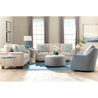
The blues and whites above are a perfect example of using neutrals for maximum impact. The white Huntington House customizable sofa and matching loveseat feature pastel blue throw pillows and the aqua area rug to anchors the space.
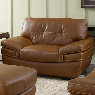
This explosion of neutrals adds tons of visual interest, yet they live in harmony within the space. The brown leather Natuzzi Editions Chair, sofa, and ottoman work with the beige area rug bring out the warmth of the white walls and wood floors.
Love them or hate them, neutrals are an important part of any colorway. They give spaces a grounded and cozy feel, while adding elegance that bright colors can’t do on their own. Whether you go bold with a neutral red or create harmony with a calming blue, these new neutrals are anything but boring. Add them to your home with abandon, you can’t go wrong.
Read Baer's Furniture Reviews and learn more. Visit Baer's Furniture on Houzz for more design inspiration.
White Neutral: The Original Neutral
White is the original neutral and for good reason – it is smack dab between cool and warm. It works beautifully in modern and traditional décor. It is a chameleon that has sublet shades as the light passes through your space over the course of a day.The blues and whites above are a perfect example of using neutrals for maximum impact. The white Huntington House customizable sofa and matching loveseat feature pastel blue throw pillows and the aqua area rug to anchors the space.
Blue Neutral: Quiet and Calming
Aqua is the new white for country cottages and coastal homes. It perfectly complements an ocean view or the greenery of the countryside. It is a quiet wall color that blends seamlessly with the great outdoors. This blue-green pastel has personality to spare and is best paired with white trim, light floors, and accents of deeper aqua and dark chocolate.Pewter Neutral: Warm and Comforting
The warm grey of pewter comes from a dash of beige, making this color the perfect version of greige. It feels as cozy as a bowl of homemade soup. Use this color in large open great rooms with scarlet, tangerine, or turquoise accents.Dark Gray Neutral: Deep and Mysterious
A saturated gray-brown-black can read as black, but not as stark. An easy color to live within any space, this soft, sun-bleached shade adds depth and mystery.Mauve Neutral: Soft and Peaceful
A light, taupey mauve is as gentle and soft as a cashmere sweater. It can turn a bedroom into a beautiful cocoon of warmth and peace. Use it on the walls and bring in gray, eggplant, ivory, or chocolate for contrast.Red Neutral: Surprising and Inviting
A bold, earthy red, like the one common in pre-Columbian art or Turkish rugs is surprisingly neutral. It goes with anything and is great for accent walls and entryways. It fosters an incredibly inviting, warm vibe that draws people into the rest of your home.Brown Neutral: Natural and Inspirational
When beige just won’t do, look to nature for inspiration. You’ll find greens, blues, and browns all coexisting together in riotous harmony. It is brown that brings them together. Use it in foyers, bedrooms, and dining rooms for maximum impact.This explosion of neutrals adds tons of visual interest, yet they live in harmony within the space. The brown leather Natuzzi Editions Chair, sofa, and ottoman work with the beige area rug bring out the warmth of the white walls and wood floors.
Beige Neutral: Dependable and Warming
This dependable neutral goes well with any white, even a white that has gone wrong. It’s best on walls in a washable matte, as this color changes hues depending on the light. It warms an entryway and creates a calming sanctuary in a bedroom.Lilac Neutral: Pretty and Unexpected
When paired with intense, deep colors such as black, charcoal gray, or navy blue, a pretty lilac is an unexpected neutral. This shade with the perfect balance of tone and saturation is like a sunset through a soft filter. Use it on the ceiling of a masculine room or as a surprise hint of color in the interior of creamy kitchen cabinetry.Stone Neutral: Warm and Soothing
Another chameleon color, stone can be seen as taupe, gray, or green, depending on the light. It’s great on walls in a matte finish to warm up whites or on trim work in a high-gloss finish. It brings a warm and soothing vibe to almost any space.Love them or hate them, neutrals are an important part of any colorway. They give spaces a grounded and cozy feel, while adding elegance that bright colors can’t do on their own. Whether you go bold with a neutral red or create harmony with a calming blue, these new neutrals are anything but boring. Add them to your home with abandon, you can’t go wrong.
Read Baer's Furniture Reviews and learn more. Visit Baer's Furniture on Houzz for more design inspiration.
Friday, July 13, 2018
How to Add the Color Gray to Your Interior Décor
When it comes to interior decor, gray may seem like the opposite of color. And this is technically true. However, adding gray to your interior decor is a great way to highlight any color palette, from bold to subdued. It may not seem like much on its own, but mixed with other colors, it helps to create a put-together, sophisticated look.
Here are four ways to add gray to your interior decor.
Go bold with high-contrast black and white geometric patterns and add pops of supersaturated color. Layer colors and prints together and let the connecting power of your gray sofa tie these colors to contrasting colors.
Or if you prefer a softer, subtler look, paint the walls a buttery yellow and add delicate prints to give the space a more relaxing feel. Layer up a mix of pillows to create a richly textured look.
Mixed with wood floors, a cool gray rug not only helps define the space, it also contrasts with the warm wood tones that bring out the best in both. Layer a gray rug over any wood tones anywhere from blonde to espresso. The rule of thumb is the light the floor the warmer the gray.
If your palette includes bold, bright colors, use a gray area rug to connect the colors without adding excess drama. Technically, gray is a mix of all colors, which is why it can be used to tie different colors together.
While the white kitchen is a popular look, a totally white-on-white palette can be too stark for some. Soften the look by painting the walls a gentle, barely there gray. This will add depth without interfering with the neutral palette, creating a look that is eye-catching and approachable but not jarring.
Silver and gray go naturally together, and combining matte gray walls with shimmering silver metals adds instant depth. But don't stop there. Gray also plays well with warm metallics such as gold, copper, bronze, and brass. Try adding one of these metallics on sconces, pendant lights, and faucets for instant glam.
If you have a home with architectural details that you want to highlight, rather than using white or wood for crown molding or doors, try a gray. This will subtly underscore every architectural element.
If you have a wall with brick or stonework, try matching it up against a gray. In much the same way that gray brings out the best in wood tones, it can accentuate the warmth of stonework. It both highlights the wall as a feature and integrates it into the overall look of the space.
Get home decor shopping tips from a Baer's Furniture executive. Find more design inspiration and read Baer's Furniture reviews on Houzz.
Here are four ways to add gray to your interior decor.
1) Curl Up on a Gray Sofa
A dark or medium gray sofa is one of the best interior design investments you can make. It will work with bright colors and add depth to neutral palettes. For example, the Oyster Bay Ashton leather sofa by Lexington expresses breezy comfort that gives your space a casual chic feel. And because gray resists trends, it will stay classic through years of use and interior decor changes.Go bold with high-contrast black and white geometric patterns and add pops of supersaturated color. Layer colors and prints together and let the connecting power of your gray sofa tie these colors to contrasting colors.
Or if you prefer a softer, subtler look, paint the walls a buttery yellow and add delicate prints to give the space a more relaxing feel. Layer up a mix of pillows to create a richly textured look.
2) Sink Your Toes into a Gray Area Rug
A soft, plush area rug makes a space more inviting. Add one in silvery gray, and it gives that same space an instant air of luxury. But depending on how you style it, a cool, textured area rug can do more than add interest.Mixed with wood floors, a cool gray rug not only helps define the space, it also contrasts with the warm wood tones that bring out the best in both. Layer a gray rug over any wood tones anywhere from blonde to espresso. The rule of thumb is the light the floor the warmer the gray.
If your palette includes bold, bright colors, use a gray area rug to connect the colors without adding excess drama. Technically, gray is a mix of all colors, which is why it can be used to tie different colors together.
3) Paint the Walls Gray
Give your room an instant update by replacing a dated neutral-colored wall with a gray or greige. This color adds more richness and depth than a plain white.While the white kitchen is a popular look, a totally white-on-white palette can be too stark for some. Soften the look by painting the walls a gentle, barely there gray. This will add depth without interfering with the neutral palette, creating a look that is eye-catching and approachable but not jarring.
Silver and gray go naturally together, and combining matte gray walls with shimmering silver metals adds instant depth. But don't stop there. Gray also plays well with warm metallics such as gold, copper, bronze, and brass. Try adding one of these metallics on sconces, pendant lights, and faucets for instant glam.
4) Break Out of the Molding Mold
White molding (yawn) is okay, but have you considered breaking out of that mold and trying gray? A gray shade on your trim or doors can give your home a stately, architectural appeal.If you have a home with architectural details that you want to highlight, rather than using white or wood for crown molding or doors, try a gray. This will subtly underscore every architectural element.
If you have a wall with brick or stonework, try matching it up against a gray. In much the same way that gray brings out the best in wood tones, it can accentuate the warmth of stonework. It both highlights the wall as a feature and integrates it into the overall look of the space.
Get home decor shopping tips from a Baer's Furniture executive. Find more design inspiration and read Baer's Furniture reviews on Houzz.
Sunday, July 8, 2018
9 Tips for Staging Your Coffee Table
Looking for a way to give your family room an easy update? How about styling your coffee table? A table with an accessory and a small vase of flowers looks thoughtful, while a gorgeous table scattered with magazines just looks sad. From laying out a tray to arranging a personal collection, these tips will show you how to create a chic, stylish look for your coffee table.
Learn more and read Baer's Furniture reviews. Follow Baer's Furniture on Facebook for more design inspiration.
1) Display a Cherished Collection
Books, pottery, or boxes can make perfect coffee table displays. Group together similar or same-colored pottery in various heights and shapes. Use a few books as risers to create height where you need it. Mix up your sizes, too many small pieces can look cluttered while too many large ones will feel too heavy.2) Make a Grid
This layout is great for an oversized coffee table. Tape off sections into a grid so that you have a guide for positioning your objects. Place your objects within these compartments. Keep the scale of your table in mind and fill your compartments with stacked books, baskets, plants, large pillar candlesticks, or a bowl of fruit. Play with the composition until it feels just right.3) Add Layers with Trays
Trays are great for creating layered displays. They can hold small- and medium-sized vases, candlesticks, potted plants, and more. The also keep large coffee tables from feeling massive and taking over the space. Layering with a tray helps break up the space, gives it structure and symmetry, and anchors items that might otherwise look like they were floating aimlessly around. The Bali Hai Capri Square Cocktail table by Tommy Bahama is accessorized perfectly by the small tray, stacked books, and starfish.4) Add Some Natural Elements
Natural elements such as antlers, vintage wooden bowls, and jars of shells give a room some history. These objects can add dimension and change the feel of a room. You can easily switch them out or rearrange them to create a new look.5) Add Seasonal Touches
The coffee table is a great place to add seasonal flair to your family room. Add a vase of fresh flowers in spring, a jar of shells in summer, and a gourd or fall leaves in the fall. You can add holiday decorations or some subtle bling to celebrate the winter season.6) Vary the Heights of Your Accessories
Whether you are displaying a collection, going old school with flashy coffee table books, or creating a simple arrangement with a vase of flowers and stacked books, remember to vary the heights of the items on your coffee table. This will give your space more visual interest and create a more eye-catching tablescape.7) Use the Rule of Thirds
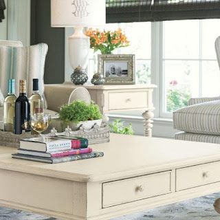
This age-old composition rule will come in handy when you are accessorizing your coffee table. Dividing the space into three sections can help you choose which items look best. This method is good for long, rectangular tables, such as the Pavilion Storage Cocktail table by A.R.T. Furniture.8) Add Pops of Color
Use colorful accessories that play off the colors of your décor. Contrasting colors can give your coffee table dramatic interest. If your palette is neutral, use a few bold colors. If you have a lot of dark woods, try some metallic items on your coffee table.9) Choose a Side
If you have a larger coffee table and want a minimalist look, you can accessorize one side. This keeps the coffee table from seeming too cluttered and gives you plenty of space for family and friends to place a cup, plate, or personal items. No feet allowed.Learn more and read Baer's Furniture reviews. Follow Baer's Furniture on Facebook for more design inspiration.
Subscribe to:
Comments (Atom)

